|
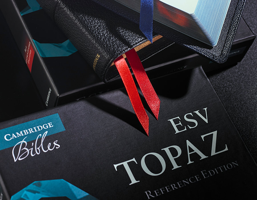
The new range will be called the Topaz. A creative brief was given to us photograph the new Bible. The Topaz name refers a new Bible setting. It is traditional for Cambridge to name their Bible settings after precious stones, and the Topaz jewel has been used in the branding of this Bible. The Topaz design has been influenced by traditional KJV settings, and will be applied to a range of Bible translations, thereby creating a new ‘family’ of Cambridge Bibles. This new family will join Cambridge’s existing Clarion, Pitt Minion and Wide-Margin families.
The Topaz distinguishes itself by being a larger format, two-column reference Bible. It uses a verse by verse arrangement of the text, and the verse and chapter numbers are picked out in red for the purposes of navigation. Cambridge wanted us to capture the overall look of the Topaz, in particular key features such as the quality of the leather, the art-gilt edges, the flexibility of the binding, and the high quality satin ribbons. As Cambridge Bibles stand for quality, craftsmanship, tradition and beauty, these are the values we needed to encapsulate in the photographs. The autumnal theme comes from the time of year the Topaz will be released. Based on this brief, we came up with the below images. We show the scale of the Bible and its large format by using a vicar from a local parish, the time of release by using an autumn scene, and the quality of product by emphasising its key features. Cambridge was very pleased with the result. Comments are closed.
|
News & blogBrowse our blog pages for details of our recent photography projects and latest news. Archives
January 2021
Categories |






 RSS Feed
